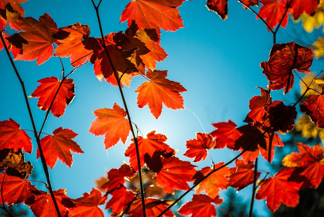
 Autumn really is a visual feast! A second spring as the French novelist Albert Camus puts it - "What’s the autumn? A second spring, when every leaf is a flower.” And what ‘flowers’ it brings - golden hues, vibrant yellows and bold reds clashing brilliantly with contrasting colour combinations of red against green, blue against orange - Colour Theory brought to you by Mother Nature! As we already know, being in nature has a wonderful effect on our bodies, helping to soothe and ease stress. Forest Bathing or shinrin-yoku has been known to activate a person’s parasympathetic nervous system, helping the body to enter a state of relaxation. But today I want to focus on why the colour of the outdoors is also beneficial. Karen Haller FRSA, is leading international authority in the field of behavioural colour & design psychology, she says, “When we use colour and design consciously, we get to create considered designs that improve the well-being of everyone involved… Every step we take away from nature we move further away from ourselves and what it is to be human.” But what is Colour Theory? According to colormatters.com there are three basic categories of colour theory that are logical and useful: The colour wheel, colour harmony, and the context of how colours are used. The Colour Wheel Sir Isaac Newton developed the first circular diagram of colours in 1666. Since then, scientists and artists have studied and designed numerous variations of this concept. This basic Primary Colour wheel can be expanded upon to include secondary and tertiary colour variations, please see diagrams below. 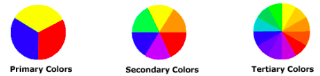 Colour Harmony In visual experiences, harmony is something that is pleasing to the eye. We are aiming for balance - extreme unity leads to under-stimulation, extreme complexity leads to over-stimulation. Harmony is a dynamic equilibrium, and nature is fabulous at it! Analogous Colours 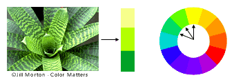 Analogous colours are any three colours which are side by side on a 12-part colour wheel, such as yellow-green, yellow, and yellow-orange. Usually one of the three colours predominates. Complimentary Colours 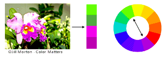 Complementary colours are any two colours which are directly opposite each other on the wheel, such as red and green and red-purple and yellow-green. These opposing colours create maximum contrast and maximum stability. Nature is great at this - especially at this time of the year! Nature! 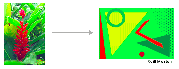 In the illustration above, red yellow and green create a harmonious design, even though the combination of colours do not fit into a technical formula for colour harmony.
Colour Context Colour Context is how colour behaves in relation to other colours and shapes. This is a complex area of colour theory. One example could be the way red appears vibrant against green, but dull against orange. So let’s take nature’s lead - get outside more and soak up all the wonderful colours she has to offer. And if we can’t get out so much, let’s bring her colour pallet into our homes for a more happy, harmonious life. Wishing you a happy, healthy October. Lots of love, Zoë xx Source: colourmatters.com | Karenhaller.com
0 Comments
Your comment will be posted after it is approved.
Leave a Reply. |
Zoë HendersonIntuitive healer, horse whisperer and animal communicator who works with the angels to offer healing and guidance to all beings. Archives
February 2023
Categories
All
|
 RSS Feed